In his post, Hawk identifies bearish options flow in several homebuilder names. This coming after posting a very strong 2012 thus far.
"Lennar (LEN) put volume of 20,870 ran 5X daily average mostly due to 1 large spread on the PHLX where a trader sold 5,800 August $29 calls and bought the August $24/$19 ratio put spread 5,000X7,100 with shares trading near $25. The visual display of the spread is below, and although may be a hedge to an existing long holding, it still shows caution and reason for protection."
You can read the rest of the post here.

The next article comes from a poster I've starting more recently following. OptionPit offers a paid mentoring program run by some folks that seem to really know the ins and outs of the market. They also post plenty of insightful free articles for everyone's education.
In their article, OptionPit explains the myth behind time decay over a weekend. Readers who follow my trades or have a similar trading style should pay close attention.
"So what do market makers do? It’s pretty simple. We begin to decay the entire weekend as early as we possibly can. Although every market maker manages this weekend decay differently, I can give an example of what I might have done when I was on the floor. On Thursday about mid-day I would turn off all of my quotes. I would then go into my options quoting software and begin moving my software’s theoretical day forward Friday (this is actually very similar to using the date function in TOS, OV, or Trade Station)."
You can read the rest of the post here.

The last article doesn't come from someone I follow on Twitter, but a blog I keep an eye on from time to time. VIX and More is a blog that focuses on volatility and volatility products, but has plenty of great information covering numerous topics marketwide.
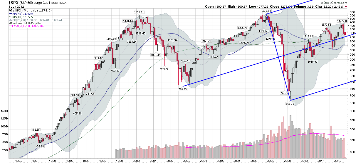
In this article, they use the Andrew's Pitchfork tool to map out a long-term direction of the S&P 500. Note that they are using a monthly chart in this example.
"I mention all this because if one looks at a monthly Andrews Pitchfork chart for the last two decades, the moves in stocks over the last 2 ½ years or so look remarkably unremarkable, with stocks hugging the middle prong of the pitchfork, which currently points at a trend line “fair value” for the SPX of about 1265.
Part of the reason I am posting the chart below is that it shows a surprising degree of moderation and mean reversion in recent stock moves."
You can read the full article here.
No comments:
Post a Comment